DESIGNING DASH PARKOUR: A HOLISTIC R&D-PROJECT
Design is an empathic way of thinking and working, and in our field, designer is the cross-field intermediary who needs to understand all the aspects of his/her subject to be really successful.
Design is an empathic way of thinking and working, and in our field, designer is the cross-field intermediary who needs to understand all the aspects of his/her subject to be really successful.
And I’m not only talking about the users; we need to understand our own team and other project stakeholders. To know their goals and points of view will help you understand aspects of your subject that your own knowledge doesn’t yet cover and thus, enable you to better help them and steer their efforts towards a common target. This is particularly true on fields where we design products or services for culturally engaged users. Our R&D project for Parkour Dash –series is a great example of this in action and has given a variety of interesting and challenging tasks for us to conquer throughout the process.
To create a successful product for a culturally engaged audience, we need to understand them and their culture thoroughly. We need to do our research; find and curate information from the culture in question and transform it into sensible and naturally applicable concept the users feel comfortable using and being associated with from the get-go.
Dash Parkour is a product series that is born and molded by Parkour as a culture. We researched parkour for weeks and held workshops with parkour professionals and parkour actives, generally known and referred also here as ‘Traceurs’, to further understand the culture we were designing our product for. As we got further inside it’s habits and values, we realized how vast and deep their inner respect for the sport and each others was, and how important it was for us to show in our products how much we valued the sport and its actives. This is why the respect towards traceurs’ and parkour itself is unspokenly visible through our products’ visual nature and references to visually interesting and culturally important parkour elements. These elements won’t necessarily give our less oriented users more than a visually interesting theming, but for traceurs there are references that hopefully give a solid cultural reverence. Getting the approval and respect of our core users is critical, and it won’t be possible if they don’t feel like the product is theirs or it isn’t designed in line with values and habits of parkour.
When designing a product series for a sport as physically demanding and creative as Parkour, usability is everything. This is especially true when you want to make the best parkour product in the world. To accomplish this, we need to understand, calculate and test every last centimeter of gaps, heights, widths and lengths to find the perfect fit between challenging, intuitive and safe. This product series will give an intuitive environment for both new users and professionals and everything between. The skill level spectrum is incredibly wide, as are the personal, creative styles we need to accommodate.
The shapes and visual nature of the products need to be distinctive. There are hundreds of parkour boxes in the world that can’t be visually distinguished from one another and ours wouldn’t be one of them. Searching and bringing forms and shapes from the streets in to the design gave us a great platform to create a unified, yet prosperous way of creating a great variety of different layouts and combinations, without designing hundreds of differing components.
Traceurs don’t see the world like everybody else. From their perspective, walls, floors and rails are not just passive structures to help our normal lives; they are interactive, changing series of forms creating various ways of practicing their favorite sport. The tilted shapes in our products back up this image and accompany traceurs’ way of viewing their surroundings from different perspectives. Tilted shapes also work great with parkour as a sport, giving it unconventional angles and approaches that simply can’t be duplicated with traditional box shapes.
Welding all this into the designed shape nature of our products couldn’t have been done without our parkour experts. Fine tuning every shape and distance took a great effort from our designers and parkour professionals and its value couldn’t be more important. The end result speaks for itself: simple and humble, yet elegant in every detail.

Visual nature of Dash Parkour springs from the streets, merging with modern, geometric visual world. The shapes and materials are brought from the streets, creating a monumental and sinking feel to the product. This gives a visual feel of an urban environment with a small hint of post-apocalyptic wibe with its sunken elements and broken colored wall murals. Illogical shadows cast on the products give an abnormal sense to them and create small optical illusions with the real shadow cast on top of them.
The color base of the product is created with toned down grey palette. Wall murals, born from and representing parkour, bring the visual world to life, along with colors derived from these murals. These wall murals got their content and inspiration from Parkour, representing it’s most iconic and known elements. These elements ended up being the following:

The murals are done with vibrant, yet serious, broken color palettes, bringing color to the otherwise calm grey palette of the products. These murals’ color palettes and contents were carefully ideated and curated with parkour professionals and then briefed to a hired graphic designer to be developed and fine-tuned. As the murals are the single most important visual element on our product, we saw a great deal of effort to search for a graphic designer whose style would match our product’s perfectly.
Visual relation to the products’ surroundings is born through geometric shapes, working as the products’ “shadows”. Illogical directions and tilted shapes create a playful visual continuum and provide a new layer of activities, as they work as pathways for the users to follow and aim at. With all of these aspects carefully thought through, we end up with an authentic and vibrant product which is naturally applicable to almost any kind of environment and approachable and intuitive to users from all target groups. It will also be visually attractive to people from outside of parkour and give the local community great value by bringing Parkour closer to it and making it a part of the local infrastructure.
So, to be successful in a project like this, and I believe we were, we need a team of professionals who can each keep their end of the work and listen and respect each other. Remember, that no-one can replace professional experience-born knowledge out of thin air and Google. Especially theoretical knowledge of culture, habits and values. These things need tacit knowledge that can’t be learned over-night. If you don’t have a professional asset to assign to a task like this; don’t push it to “Catherine from Procurement”, but get one!
When you have a group of well briefed professionals, agile and confident project management and an effective intermediary steering all the stakeholders, you will go through a fluid, transparent process, and end up with a solid, credible end result in your hands. This is what happened here at Lappset this last year, and I couldn’t be more proud of the people I’ve been working with in this project.
Webinar Announcement: Designing for Climate Resilience Webinar Announcement: Designing for Climate Resilience Webinar Announcement: Designing for Climate Resilience Continuing with the success of our 2025
BoxUp Receives Recognition at SAPCA Awards 2026 BoxUp Receives Recognition at SAPCA Awards 2026 BoxUp Receives Recognition at SAPCA Awards 2026 Jupiter Play & Leisure
CANTLEY PARK INTERACTIVE PLAY SPACE CANTLEY PARK INTERACTIVE PLAY SPACE THE BRIEF: The council was committed to creating a new destination play area on site
Promoting Inclusivity in Public Parks and Outdoor Spaces A Call to our Clients In the realm of outdoor play and recreation, a profound shift in
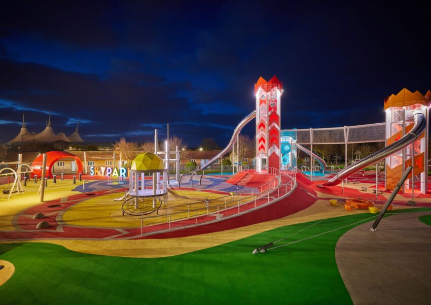
Introducing the UK’s most exciting playground… Jupiter Play & Leisure are delighted to have partnered with renowned holiday destination Butlin’s to design and
It is essential, now more than ever, to stay current on what trends are driving the future of play. Play is integral not only to